Today I am going to talk to you about the most common Web design mistakes made by non – designers. I am going to tell you a few of them
1.Increase the use of visuals:
It is found that most of the non-designers use too many words, or tags for designing a website. Therefore I would like to recommend that give more importance to the visual elements and use only the most important elements, try to minimize the textual content and give more focus on visual elements which will help the viewers to understand what actually are you trying to convey?
2.Try to keep the content short:
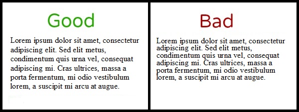
Now it is most often found that the non designers try to include content formed by many lines, for filling up the space on the page. So avoid this practice. Try to minimize the text in the content. Instead of using too many lines of text, you can convey the same message using few lines of text.
3. Mismatching fonts:
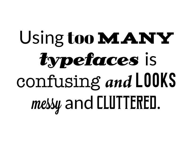
It is also a very common mistake, the armatures have knowledge of different fonts and they try to use as many different fonts as possible thus they think that the design will look good. But it’s not the case; the use of too many types of fonts in the design makes it look unprofessional instead of looking beautiful.
Even if you want to use different types of fonts then instead of using too many fonts try to use minimum fonts. You can take help of various tools like Italics or bold for showing the variations in the fonts which will require efforts and it will also make your design look professional.
4. Choosing Wrong Colors for Designing:

You all know that colors play a very important role in the website design and therefore it is important to select right kind of colors, but sometimes the non-designers makes mistake by selecting more than one color for designing and it looks inappropriate
They think why not try to mix and match them but there are certain principles while selecting the colors which should be followed properly.
The main aim of designing is that the visitor or the viewer must be able to read and understand what you want to convey and at the same time it should also be able to attract their attention, so always use right amount of color contrasts at the time of designing
5.No use of negative space:
It is also one of the most common mistake made by the non-designers, they try to fill up each and every space on the page and try to avoid using negative spaces which makes the content look odd.
The most common website which has used negative space in right way is the Google page. It has only a search option and therefore there is no need to look for it anywhere else.
6. No proper way for placing the elements:
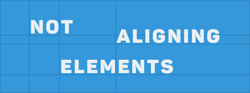
Here also the non-designers sometimes ignore to place the elements properly on the page. What they try to do is that, just for the sake of filling up the space on the web page, they align the elements anywhere, so there is no certain pattern or alignment seen in the elements, which is not a good practice.
7. Unable to create contrast:
Another point where non-designers make mistakes is that they fail to choose a correct contrast i.e. you must have seen some websites in which light colored text is written over a dark background, but instead of it if you use dark colored text on the light colored background then it will achieve a nice balance and it will also make the design look great.
8.Not looking after the size of the elements:
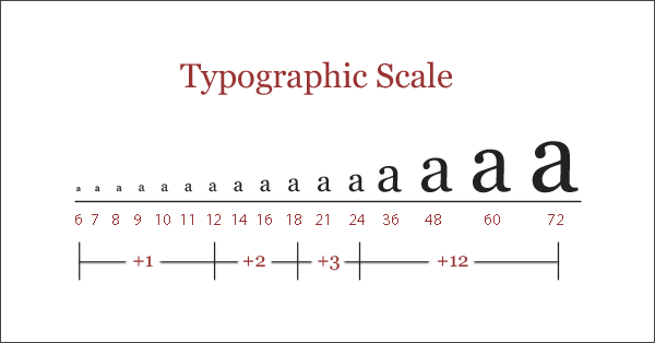
There are many scaling tools available for you, but still there are some non-designers who doesn’t take help of those tools and try to use same size for every element. Therefore I would recommend that use these scaling tools they will make things look good and also it will help to emphasize different elements which will grab the attention of the visitors.
9.Unable to read the Text:
One more mistake which is made by the non-designers is that they use dark colored text on the dark background image which makes the text unreadable to the visitor. So instead of using a dark colored text on a dark background image, try to use light colored text over dark image then it will certainly improve the readability of the text
10.Inappropriate Font combinations:
Non-designers try to use plain image on which they don’t use dark color fonts on it which doesn’t make the page look good and also doesn’t help in conveying the use of those fonts so instead of that if you try to use an image at the background, which helps in conveying the importance of the fonts then it will help you in achieving your goals
11. Use of Insufficient space between lines:
The non-designers sometimes ignore one important point that is they use text in which some words gets stuck together and some other words are separate from them, so in that case they can use line break option which helps to separate the header, from the paragraph and there is a separation between them, which makes it look good.
12.Improper use of images:
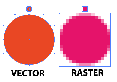
The non-designers mostly try to scale up the image which makes them look pixilated. So it is good practice to scale the images down instead of scaling them up, also you can use various tools offered by Power Point in which you get various texts, shapes which you can align as per your requirements as well as you can stretch them up but still then the text will not lose its resolution.
And when non-designers will start to use them, those contents or images or text will come to life!
13. Struggling for achieving a complete Symmetry:
It is not compulsory to always have complete symmetry whenever you are designing anything for the website instead you can use various shapes or modernized designs and can create a balance with it then there is no need to look for the perfect symmetry.
14.Unable to communicate effectively:
This mistake can be made by non-designers as well as designers; sometimes they try to overdo things and thus they fail to achieve their ultimate goal of designing the content for the visitors. So try to avoid overemphasizing the mistake of using too many shapes, or objects at a time in your content.
15. Inconsistency:
Another mistake made by the non-designers is that they are inconsistent and the key to design is consistency, as well as use of contrast, colors etc. So it is important to remain consistent and also try to create a sense of integrity, conceitedness with your design.
Summary:
So that’s it for today! I hope you will definitely take the advantage of correcting these mistakes which I have mentioned and I promise you it will definitely create a clean and crisp design. It will also help you in conveying your message accurately. So use these steps as they are really very easy to do. Thank you! See you guys next time.
Visit:- Best Web Designing Service
